

 and Cardano (ADA) Investors Target 20X Returns with Kelexo (KLXO) Amid Post-Halving Stability")


The Fed recently released the March money supply numbers, and the story hasn’t changed. M2 surged from early 2020 through early 2022, thanks to $6 trillion of deficit spending that was effectively monetized. Since its peak in April ’22, M2 has declined by almost $1 trillion. This all adds up to the biggest seesaw in U.S. monetary history. As the dust continues to settle, we see that a lot of the excess growth in M2 has been absorbed by a bigger economy and suppressed by higher interest rates, which have boosted the public’s willingness to hold on to the extra money. The question now is not whether inflation will rise, but rather how much further it will decline.
Chart #1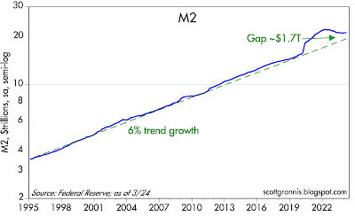
Chart #1 shows the history of M2 growth (plotted on a logarithmic y-axis so as to show constant rates of growth as straight lines). The huge bulge in M2 which began in Q2/20 was fueled by about $6 trillion in Covid “stimulus” checks, which were effectively monetized (not borrowed, but printed) and largely sat in people’s checking accounts for almost two years. (Prior to this, deficit spending by the Treasury was routinely financed by selling bonds, which created no new money as a result.) The “bulge” in M2 rose to a high of $4.7 trillion in Dec. ’21 and has now fallen by almost two-thirds. This was the result of negative growth in M2 and ongoing growth in the economy.
Chart #2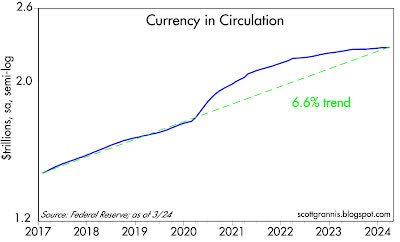
Chart #2 shows the growth of currency in circulation. This is a fairly good measure of money demand since no one holds on to currency without a reason to do so. Excess, or unwanted, currency is easily returned to the banking system in exchange for interest-bearing deposits. This chart demonstrates the significant increase in money demand from 2020 through late 2021, a time when uncertainties were running rampant, and it was difficult to spend money. Since early 2022, money demand by this measure has returned to “normal.” Rising money demand kept the bulge in M2 from being inflationary, while declining money demand coincided with an increase in inflation. In short, for the past two years, the increase in inflation that has proved so distressing was simply the result of unwanted money being spent: too much money chasing too few goods. Money demand has apparently returned to more normal levels now, so, with a lag, inflation is likely going to continue to decline.
Chart #3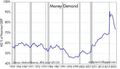
Chart #3 is my definition of money demand: M2 divided by nominal GDP. This is best thought of as the percentage of total income (GDP) that the public chooses to hold in the form of readily spendable cash (M2). Here we see that money demand – after surging in the wake of the Covid panic – is rapidly returning to what might be termed normal.
Chart #4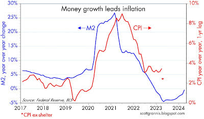
Chart #4 compares the year-over-year growth of M2 with the year-over-year change in the CPI, which has been shifted to the left by one year to suggest that there is a one-year lag between changes in M2 and changes in inflation. The red asterisk at the Mar. ’24 mark is the rate of CPI inflation ex-shelter (see this post for a more detailed explanation). It would appear that the lag has lengthened a bit to perhaps a year and a half. That further suggests that given the decline in M2, we are likely to see further declines in inflation over the balance of this year.
Original Post
Editor’s Note: The summary bullets for this article were chosen by Seeking Alpha editors.
")

")


")
